Innovation in logo design: an evolving logo for the Max Planck Institute, and an infinitely variable one for Saks Fifth Avenue.
Innovation in logo design: an evolving logo for the Max Planck Institute, and an infinitely variable one for Saks Fifth Avenue.
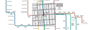
An interesting design study of the San Francisco commuter rail network. They’ve also come up with a very practical map design.
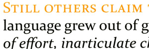
Ooh, pretty fonts…

The Matching Pantone Flickr set is hilariously brilliant (if you’re into design, that is).

Recent computer games are amazingly photorealistic, as demonstrated by these screenshots from the new Crysis engine. The HDR technology developed by Valve also looks promising. Of course, the hardest part will always be representing characters and avoiding the uncanny valley.

Alternate designs for the World Cup logo. I like 5, 9 and 11.

Fantastic music video for Gnarles Barkley’s Crazy.

Amazing photorealistic vector images.
New fonts for Windows Vista. Speaking of Microsoft and fonts, their ClearType technology is really clever (OS X’s font smoothing is basically the same thing, and of course the debate rages as to which one is better).