
Signal vs. Noise posts about the technology of the $100 laptop.
You can pour water on the keyboard…You can dip the base into a bathtub. You can carry it the rain. It’s more robust than your normal laptop. It doesn’t even have holes in the side of it. If you look at it: dirt, sand, I mean, there’s no place for it to go into the machine.
I got a chance to play with one of these the other day. The hardware is indeed very nice, with a distinctive design and a very solid feel. Unfortunately the software is horribly unintuitive. Maybe it’s still in development, maybe I didn’t spend enough time with it, or maybe I’m just too used to regular interface paradigms. My guess is that it’s a consequence of trying to reinvent the wheel, in the process disregarding decades of accumulated user experience knowledge.
I’ve posted about the $100 laptop before.

Pentagram has designed the $100 laptop’s user interface, codenamed Sugar. The human interface guidelines provides more insight into the design philosophy. Harry Brignull from 90 Percent of Everything has posted some thoughtfully skeptical comments, along with an informative screencast.

The reason I haven’t posted this week is that I was lucky enough to attend Steve Jobs’ keynote at MacWorld on Tuesday. My entire group camped out the night before (we we’re second in line!)… and of course I ended up sleeping for 12 hours straight last night. While the iPhone has already been extensively dissected on the web, I wanted to post some thoughts and a round-up of relevant links.
Being at the keynote was an incredible experience. Jobs is an amazing salesman, and you could just see the sparkle in his eyes as he revealed his new baby. His demo was perfectly polished, with a strong consistent message (“5 years ahead of any other phone”) and lots of nice one-liners (“and boy have we patented it”). He had phone conversations with Jonathan Ive and Phil Schiller in the audience. Eric Schmidt made a guest appearance (we all clapped extra hard), as did Jerry Yang from Yahoo and Stan Sigman, the CEO of Cingular (whose speech was awful). It all concluded with a live performance by John Mayer.
Of course, it doesn’t hurt that the product itself is fantastic. As a designer, I’m most intrigued by the touch screen user interface, which has tremendous potential for novel interactions. Something as simple as unlocking the phone becomes a slick swipe, and don’t even get me started on the zooming gesture. The industrial design is beautiful as well, with a huge high-resolution 3.5 inch touchscreen and only one button on the front face (one too many, if you ask me). It’s not tiny, but it’s very thin. All in all, a very very nice object.
Now of course it isn’t perfect. Here are my gripes:
- No tactile feedback I’m very worried that the keyboard will be hard to use. The early reviews say that the error correction software helps, but I could still see it being clumsy. My only hope is that Jonathan Ive put enough work into it as to make it useable.
- No proper Gmail integration I don’t think I can live without the fantastic Gmail mobile client. While they’ll hopefully get it working on the iPhone in time for the release, I’ll be torn between seamless Gmail integration and seamless OS integration (including fancy touchscreen interactions).
- No third-party apps Apparently, the software is locked down. I’m hoping this isn’t the case.
- No wireless sync Apparently, it won’t sync wirelessly with your computer. I have to believe this will change in time for the launch.
- No detachable battery Given the roughly 1 day of battery life, it would have been nice to be able to pop in a spare battery. I know I’ve done it on my blackberry before.
- No flash The only cameraphones that produce even remotely useable pictures at night are those with an LED flash. While we’re at it, 2 megapixels is going to be pretty standard by the time it launches.
- A couple of unfair complaints I’d like to say that 8GB isn’t enough if you expect to store videos, pictures, music, etc… but I’d feel a bit snide given that it’s a lot more memory than any other phone, and anything bigger would have made it bulkier, more expensive and more power hungry. I’d also have liked a GPS, which would have enabled even more innovative applications.
- Price point By the way he led up to it, I expected Jobs to announce a price point lower than current smartphones, something like $399 for the 4GB version. It has a lot of features, but $600 is still a lot of money for a phone. I also wonder how much it will cost without a new contract (I’m already with Cingular).
- June?? WTF? Despite all of the above, I would definitely have bought one if they’d been available. I guess the FCC made that impossible, but still disappointing.
If you haven’t overdosed on the iPhone coverage yet, below is a list of links to give you a good overview of the product.


Disco, a new OS X app, quite literally burns your CD. A brilliant touch.

More on fancy multi-touch displays, with some insightful commentary on where the technology might be heading. I’ve posted about this stuff before.

Reinventing the mail client describes some novel approaches to organizing and displaying email. I really like the person-centric one (see picture) but feel that (a) the lists should be automatically constructed and (b) purely sorting per person is too simple an algorithm.

Excellent usability review of invoicing application FreshBooks. A lot of good advice here!
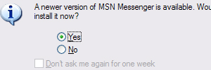
An article on the usability of software upgrades. This is actually something that Google does really well – I highly recommend trying out Google Pack if you’re a PC user.

BumpTop, a new interface for manipulating documents on your computer desktop. While some of the interactions here are cool and novel, I’ve got to wonder how useable this would be in practice (especially given that the documents have no accompanying title). A really interesting aspect of computer interaction design is the inherent advantage of previously learned interactions – replacing folders is hard partly because folders are such a well-understood metaphor.
update: PeterMe had the same reaction, except that he expressed it much more eloquently than I did and offers some interesting links to other UI experiments – including the very cool zooming interface.
