ZipScribble is a nice visualization of US zip-codes.
Is it useful? Probably not. But it sure is surprising and interesting, rather like a fractal image.

ZipScribble is a nice visualization of US zip-codes.
Is it useful? Probably not. But it sure is surprising and interesting, rather like a fractal image.

Beautiful visualizations of flight patterns across the US.

Visual Complexity is a compendium of complex data visualizations.

This kind of data visualization really makes you appreciate the complexity of Bach’s music.

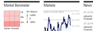
Morningstar’s market barometer is a great way to visualize changes in the stock market. Also, if you haven’t done so already, you should definitely check out Google Finance.

The authors of Freakonomics tell us about market segmentation by first name. To explore trends in names through the years, check out the Baby Name Voyager.

CabSpotting tracks Bay Area taxis.

The World Mapper project has a set of world maps distorted to represent national data.

Edward Tufte, the master of data visualization, has come up with Sparklines, which is a very compact way of displaying large amounts of quantitative data.

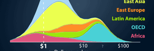
GapMinder breathes life into UN development statistics.