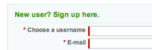
Ning.com uses the left-border of text-fields to indicate required information on their signup page. Very clean design solution.
Update: As my roommate who works for Apple points out, this doesn’t work in Safari because Safari won’t let you style form elements. I guess that’s why they still have the stars there…
