Last Friday, I went to see the opening of the new William Kentridge exhibit at SFMoma. I didn’t find very much of his work aesthetically pleasing – a lot of it is quite creepy – but it’s worth seeing for the sheer creativity of it all. His videos remind me of this crazy animated graffiti:
A couple of other pieces currently on display caught my attention. I love the contrast between the crispness of the hair and the soft blur of the background in Off The Diagonal, Buenos Aires by Leo Rubinfien:
And Tauba Auerbach’s Crumple part of the 2008 SECA award, becomes no more than a bunch of dizzying black dots when seen up close.
I’ve been meaning to post this fascinating article from the Economist about Dabbawalas:
Using an elaborate system of colour-coded boxes to convey over 170,000 meals to their destinations each day, the 5,000-strong dabbawala collective has built up an extraordinary reputation for the speed and accuracy of its deliveries.
According to the Wikipedia article, Dabbawala literally means “box person”, and they combine smart technology with a super flat hierarchy:
Although the service remains essentially low-tech, with the barefoot delivery men as the prime movers, the dabbawalas have started to embrace modern information technology, and now allow booking for delivery through SMS. A web site, mydabbawala.com, has also been added to allow for on-line booking, in order to keep up with the times. An on-line poll on the web site ensures that customer feedback is given pride of place. The success of the system depends on teamwork and time management that would be the envy of a modern manager. Such is the dedication and commitment of the barely literate and barefoot delivery men (there are only a few delivery women) who form links in the extensive delivery chain, that there is no system of documentation at all. A simple colour coding system doubles as an ID system for the destination and recipient. There are no multiple elaborate layers of management either — just three layers. Each dabbawala is also required to contribute a minimum capital in kind, in the form of two bicycles, a wooden crate for the tiffins, white cotton kurta-pyjamas, and the white trademark Gandhi topi (cap). The return on capital is ensured by monthly division of the earnings of each unit.
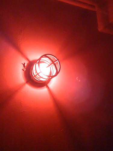
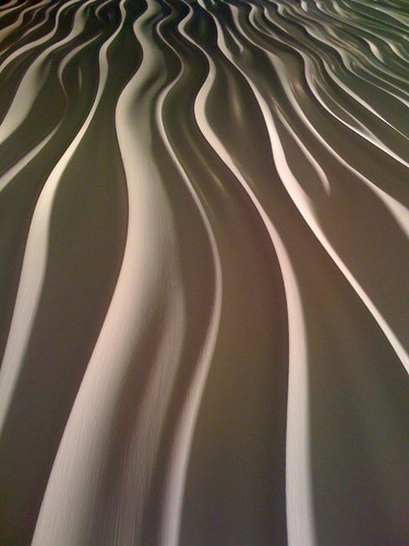
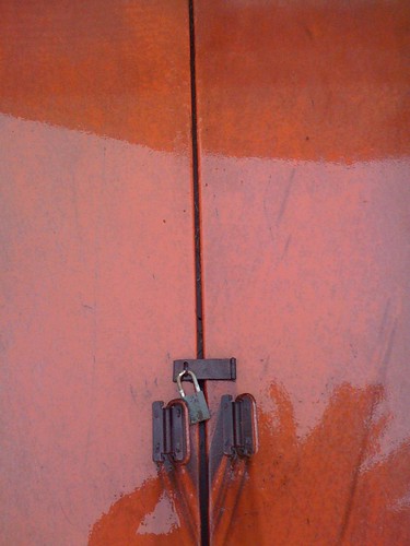
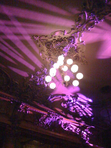
Just for fun, here are some pictures taken with my iPhone camera. Some of them are quite noisy (they really need to improve the camera), but I like them nonetheless.
Damian Ortega’s Champ de Vision (Field of Vision) installation was the highlight of my visit to the Musée Pompidou last Fall. You can see above that it’s beautiful; follow the link to find out why it’s also very clever.
Michael Lewis is quickly establishing himself as one of my favorite journalists:
He wrote a great follow-up article to Liar’s Poker, his famous book about the excesses of Wall Street in the 80s. I can also recommend reading the book itself, which is both entertaining and highly relevant to today’s crisis.
He just published a story about Shane Battier, the NBA’s “no-stat all-star”. Despite no particular interest in basketball, I was fascinated by how conventional statistics can cause a player to be under-valued.
Incidentally, if you want to get the absolute best intro to the financial crisis, spend one hour listening to This American Life’s podcast on the subject. Then visit The Money Meltdown for further reading.
Disclaimer: As I get back into posting regularly, I’ll be putting up some interesting links that I collected during my months of intermittent blogging. If you’re a heavy blog reader, you may have seen some of these before.
This music video uses compression artefacts for stunning effect. I would embed it, but you really have to see it in HD. This is more creative than 99% of the video art I’ve ever seen in museums.
It’s hard to imagine a form that could be simpler: two fields, two buttons, and one link. Yet, it turns out this form was preventing customers from purchasing products from a major e-commerce site, to the tune of $300,000,000 a year.